From Fishing Huts to Holiday Hues: A Short History of Seaside Colour
Seaside colour history links painted working huts with holiday imagery; learn why palettes vary by coast and choose colours that suit a place.
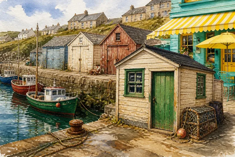
A row of fishing huts may be painted in faded blue, cream, and rust red, while the nearest beach café favors bright turquoise and lemon. Seaside colour history begins with this difference: coastal palettes grew from both useful paint choices and the images people carried home from a holiday.
There is no single seaside palette. Working waterfronts, resort streets, and newer beach businesses each use colour for different reasons, and local materials and traditions shape what feels familiar. Comparing those approaches is more useful than treating nautical blue and white as a universal formula.
How did practical paint shape the working shore?
On working waterfronts, paint had a job before it had a style. A hut, shed, boat, or door needed a protective coating, and the available products, upkeep, and local weather influenced which colors were chosen. Reusing leftover paint could also produce a lively mix rather than a coordinated scheme.
Those practical choices became part of the view. Strong colors helped distinguish one boat or storehouse from its neighbors; pale paint could make a small structure feel lighter against a dark quay. As coats weathered and faded, the changing surfaces added another layer of character.
These details still shape how people read a coast. A modest structure painted in a locally familiar shade can feel more rooted than a freshly applied palette chosen only to look “beachy.” The appeal comes from the visible relationship between a building and its working setting, not from a fixed color code.
Why did holiday imagery favor brighter hues?
As seaside places became associated with leisure, photographs, postcards, travel posters, and shop displays helped circulate a more polished version of coastal color. Stripes, clear blues, bright reds, and sunlit yellows made beach scenes easy to recognize and gave holiday objects a cheerful, portable look.
That imagery did not replace the working shore. Instead, it added a second visual language: one built around leisure, play, and an inviting impression. A striped awning or painted sign could borrow the mood of a resort image even when the actual coast nearby had dark stone, mist, or muted water.
Holiday colors often suit cafés, guesthouses, and seasonal stalls because they are legible from a distance and signal a welcoming atmosphere. But repeating the same saturated blue-and-white scheme everywhere can flatten local character. A sheltered harbor, a broad sandy bay, and a rocky Atlantic headland do not share the same light or built surroundings.
Which seaside palette suits your setting?
What makes a working-waterfront palette feel grounded?
Look at existing boats, sheds, railings, and quay surfaces, then borrow a color already present in that scene. This approach suits places with visible maritime work or older utility buildings, where a restrained, weather-friendly finish can sit comfortably beside worn timber and stone.
When does a holiday palette make sense?
Use clearer, brighter hues when the goal is a lively visitor-facing detail, such as a shopfront, café sign, or beach hut door. This suits a setting where playful leisure imagery is already part of the local identity, especially if the colors echo nearby umbrellas, boats, or painted facades.
How can a quiet coastal palette avoid looking bland?
Start with the actual tones around the site: pale sand, dark shingle, lichen, weathered wood, or the color of nearby cliffs. This approach suits exposed or subdued coastlines, where a small contrast in trim or a single warm accent can be more convincing than a full bright scheme.
For any paint choice, the coating and finish should suit the surface and exposure; follow the product label and manufacturer’s instructions, and check local rules where they apply.
How can you choose without copying a postcard?
Make the decision by observing the place at ordinary moments, not just on a clear summer day. Note the colors of permanent features, the direction a facade faces, and what visitors see first from the path or street. A palette that works in strong sun may feel harsh under cloud, while a subtle shade can disappear against nearby stone.
- Start with fixed surroundings. Identify the dominant colors in roofs, paving, cliffs, and harbor structures; choose a paint tone that relates to at least one of them.
- Decide what the color needs to do. A sign should be easy to spot, while a small hut may benefit from blending into its row.
- Separate the main color from the accent. Keep large surfaces calmer if you want a bright door, trim, or sign to stand out.
- Consider the view from a distance. Check whether the proposed colors read clearly from the public path rather than only at arm’s length.
- Look at the neighboring buildings. Repeat a local color family without matching every detail, so the result feels connected rather than copied.
Say you are choosing colors for a small hut beside a working harbor, where the sheds are mostly faded cream and the boats include dark green trim. You might use cream on the broad wall and reserve green for the door, creating a result that belongs to the scene while remaining easy to distinguish. The choice would feel different at a bright resort promenade, where a lively accent might better match the surrounding shops and beach signs.
Why do seaside colors change from place to place?
Local color is shaped by more than the sea itself. Building materials, available coatings, maintenance habits, weathering, and the role of tourism all influence what appears on a particular shore. Even neighboring towns can develop distinct habits if one is organized around a harbor and another around a promenade.
Light also changes how a color reads, but it does not dictate a single answer. A cool blue may look crisp beside pale sand and subdued beside a gray stone wall; a warm red may enliven a weathered facade or compete with nearby brick. Treat color names as a starting point, then compare actual samples against the surface and its surroundings.
Seaside colour history is most useful as a way to notice these layers: the practical paint of work, the inviting hues of leisure, and the local choices that make a coast recognizable. When selecting a palette, begin with the place in front of you and decide whether the structure should echo its working past, its holiday character, or the quieter colors of its landscape.
Before settling on a finish, view a sample beside the building in both shade and direct light. That small check can reveal whether the color supports the setting or simply repeats an image of the seaside from somewhere else.